Reflecting on ColorOurCollections
My new favorite national holiday is #ColorOurCollections week, Feb 1-5, 2016.
The idea originated at the New York Academy of Medicine (NYAM) to merge the adult coloring book craze with digital collections. Amazing libraries around the world joined in, sharing some fun and beautiful coloring books. Open Culture listed some of the big names, such as Bodleian, Smithsonian, DPLA, and Europeana. However, it was great to see so many Less famous libraries creating awesome coloring books highlighting their fascinating collections– and having some fun!
None-the-less, #ColorOurCollections also highlighted some less-than-best practices in the creation and distribution of digital files. Many of these libraries are on the forefront of digital preservation and/or user experience, but put out PDFs that violated all the rules… Its a bit disappointing since its not that hard to get a few little details right, and libraries should be leading by example.
A lot of libraries did a great job, but here are some little things that bugged me about many coloring book offerings:
- Random file names. If you are creating a PDF for public distribution don’t name it “coloringbook1.pdf” or “color-our-collections.pdf” or “jim_file3.pdf”. The file name is one of the few bits of metadata that can be easily understood without even opening the file. Make your file name descriptive and meaningful, providing the basic metadata (creator, title, and date) in a place where Everyone can see it. Example: “ThisLibrary_CoolColoringBook_2016.pdf”
- Huge file sizes. A coloring book is a mostly black and white document designed to be printed at approximately letter size paper. A reasonable file size for something around 15 pages is under 2 MB, and could be smaller. I saw many PDFs in the range of 25MB, and some over 65MB! Larger file sizes will not give better quality–this is for public web distribution not a professional press run printing glossy coffee table books. Think about your users and your web servers. People have to DOWNLOAD the PDF! Please make it a reasonable size.
- No embedded metadata. When creating a PDF you should always check the embedded metadata. If you are exporting a PDF from LibreOffice Writer or MS Word, it will have embedded metadata automatically created based on your profile. Unfortunately, many people don’t realize that and have never checked their profile. Many of the coloring books thus have metadata like “Title: Microsoft Word – coloringbook_draft3_fromJim.docx” and an Author that is the profile name of who ever first created the file. This metadata will be displayed when users import the PDF into a ebook management tool, such as Calibre. Furthermore, this information is not helpful for future users trying to understand where the file came from and what it is–and could be a bit embarrassing depending on what the automatically generated information contains. I suggest you carefully edit the metadata before exporting the final version of your PDF. It should contain a meaningful title, a subject such as “#ColorOurCollections 2016”, an author/creator that relates to the institution, and a URL to find more information.
- Lack of image metadata. If you send out a document highlighting some fascinating treasures of your collections–there had better be a clear means for users to find out more information! Every image used in the coloring book needs metadata directly on the page where it appears. Each page does not need the full archival description, but please give enough information for the users to find the item in your online collections. A title, identifier, and URL is nice. I think these references need to be given on each coloring page, not in a separate reference and index page. Online resources and printed coloring book pages are quickly disassociated from their original context–don’t expect that the information given on an introduction or TOC page will be available to users.
- Lack of overall context. Many of the coloring books were just pages of images. That is great for many users, but I would like to see a short introduction page that explains the context. Where did these images come from? Why are they interesting in the scope of your collections? Where can I learn more? This is an easy chance to communicate with patrons and invite them into our collections–which is the point of #ColorOurCollections.
- Links to paid databases. A few coloring books had reference links to paid databases. I found this a bit insulting and against the spirit of #ColorOurCollections. One of the most amazing aspects of digital collections is the ability to democratically open up the public domain to the PUBLIC. We are able to take fragile materials traditionally hidden away in a locked basement, and give them out freely to the world! It is disappointing to see objects in the public domain digitized and then LOCKED back up in a proprietary, paid database. Its even more disappointing to see those over priced rip offs promoted in a library coloring book.
- Grey backgrounds. Sorry, but this is a coloring book! Who wants to color on grey paper? Who wants to waste printer ink printing a grey page background? Some images are just more appropriate for a coloring book than others. You can not just desaturate a digitized image and call it a coloring book. Digitized pages have a color, and that page background needs to be removed to make a quality coloring book page. Generally, most coloring book images should be fully binarized, i.e. only pure black and white. Using GIMP you could desaturate (Colors > Desaturate) or greyscale (Image > Mode > Greyscale) the image, then use a Threshold (Colors > Threshold) to eliminate the “color” of the page background. The coloring book image should be reduced to clean black lines and white background. ScanTailor is a great tool that can do this pre-processing for you for many coloring book appropriate images. Play around with the output options in Black & White mode, tweaking “Thickness” and “Despeckling” until you get a good result.
Why no Digital Aladore coloring book?

ScanTailor b&w processing
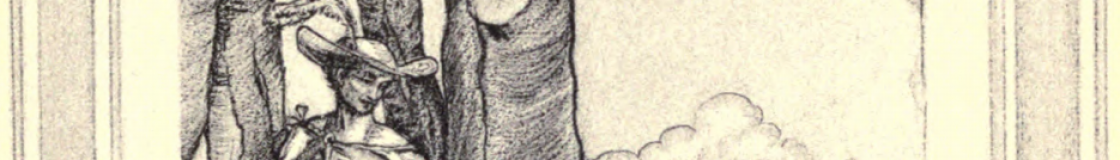
I was thinking about putting together an Aladore coloring book, but I found the images had too many shades of grey scale hatching to reduce nicely to clean lines. Processing ends up with too many black blobs, with too little detail. The images just don’t work as a coloring page! Here is a one page PDF attempt just to show you what I mean:
DigitalAladore_YwainColoringPage_2016
Anyway, #ColorOurCollections was good fun, and I am looking forward to it next year!
