Category: 6.5 Ebook Design
Ebook Design Challenges…
Designing an ebook is complicated: its somewhere between print and web design, but presents many unique challenges. In this section, 6.5 Ebook Design, I want explore the design process for the final Digital Aladore EPUB edition.
In a few earlier posts, I touched briefly on optimizing the EPUB for reader devices by creating smaller XHTML files, cleaner markup, and reasonable image sizes. However, up to this point we haven’t looked closely at styling the ebook. While the draft version of the Aladore EPUB is useable and readable (an improvement over the gibberish filled automatically generated ebook or overly compressed PDF provided at Internet Archive), a book is more than raw text. The designer must make decisions about how to most effectively present the content. The format, layout, typography, and design elements are influenced by practical and aesthetic concerns, and informed by the user model.
In the draft Aladore EPUB, there is no CSS or inline styling, thus the presentation is left up to the defaults of the reading app rendering the book. These defaults can be wildly different, having even less consistency than web browsers. For example, some readers such as Nook, automatically indent paragraphs and add a slight margin from the edge of the screen. Others do not, leaving the text uncomfortably close to the edge. This hints at the challenges of designing and styling an ebook. The file needs to be flexible enough to meet user needs and expectations in a highly diverse and non-standardized environment.
Ebooks are used on many device types, including e-ink readers, tablets, phones, and computers. This presents several hardware challenges:
- Screen sizes vary from tiny to huge. A ebook perfectly styled for the average 6” e-ink screen can look strange on a 10” HD tablet. In general, styling needs to be based on relative measures, not specific dimensions.
- Screen refresh rates vary considerably, since dedicated ereaders can save battery with minimal refresh rates. However, these low refresh rates often cause interactive features to produce strange looking artifacts or not function well.
- Input method, the devices support interacting with the document via several different means. Some older ereaders have only a few hard buttons allowing very minimal interaction with the text, other than turning pages. Newer ereaders and tablets have touch screen only which allow a more tactile and gesture based interaction. Computers are mostly mouse and keyboard focused which allows more detailed inputs, but creates a considerably different experience interacting with the text.
- Hardware specs vary considerably. E-readers tend to have low end processors and small memory to maximize battery life, thus any rendering that requires processing or loading large files becomes cumbersome.
These issues are compounded by a number of software based challenges, since ebooks must be rendered by a reading application. Users are aware that they have a choice in what web browser they use and that there is slight variety in how each browser renders content. Designers use a variety of techniques, such as browser CSS prefixes, to create markup that will render consistently in the different browser engines.
Dedicated ereaders typically have a built in reading app with a specialized and proprietary rendering engine developed by the device maker (often based on Adobe Digital Editions). Since the app is essentially hidden, users are not really aware it. There is very little information available about the different engines. Tablets can install independent reading apps, so the user can choose one based on the functionality and look they want (more often the commercial ecosystem they buy from). However, since these rendering engines are more niche, less standardized, and less well known than web browser engines, there are not as many techniques for designers to automatically account for differences. Furthermore, results from EPUBTest demonstrate that support for the full specifications of EPUB varies considerably and is low overall (if you want to try it yourself, a set of epub3 books can be downloaded to systematically test devices for functionality and feature support). Because of these challenges, there are few specific guidelines for styling and formatting ebooks.
Design Thinking
Since Digital Aladore started with a user experience problem (i.e. the existing digital editions of the book were unreadablely bad!), design thinking and user centered design has been an undercurrent theme of the project. We examine the problem, find many possible solutions, test, and iteratively refine based on the outcomes.
In the next few posts, I want to explain my design process for moving the draft Aladore EPUB into a finalized version in bit more detail. The basic idea was:
- Explore guidelines and best practices for ebook creation
- Find good examples of professional ebooks and examine the markup
- Create prototype Aladore EPUB
- Iteratively test and refine the ebook with user testing
Any Guidelines Out There?
When I started thinking about polishing the draft Aladore EPUB, I hoped to find some clear design guidelines and best practices for creating ebooks. However, I found very little!
Most of what is available is narrowly focused on a particular distributor (e.g. Amazon), usually discussing the publishing process not specific design details. Thus, there are many guides for how to submit your work to a commercial distributor that will do secret magic behind the scenes to create the ebook for you, but hardly anything about how to do it yourself.
Furthermore, many guidelines focus on a single device (e.g. iPad). Although this side-steps some issues trying to accommodate the confusing inconsistency of ereaders, designing for a single device is not very sustainable because of rapid change. For example, many people design based on the specs of the lucrative iPad and proprietary iBooks (a modified EPUB3 with tougher DRM). The iPad had a small set of build in fonts, so designers tend to reference those specific fonts in CSS. However, Apple suddenly changed the set of built in fonts, rendering those specific styling instructions useless. Embedding fonts to avoid this issue is rare with EPUBs since it would increase file size and complexity, as well as introduce legal licensing concerns.
In general, ebook design is a balance between print typography and web design, so resources from either field are partially relevant. Here are a few ebook specific resources that I found helpful:
- Rebecca Springer, “User experience for illustrated non-fiction ebooks”, Ebookcraft 2015, https://booknetcanada.wistia.com/medias/upl69kizz6. Speaks about the user’s “hierarchy of needs” and specific areas to optimize user experience.
- Joe Clark, “Web Standards for E-books,” A List Apart, March 09, 2010, http://alistapart.com/article/ebookstandards. Talks about the typical publisher workflow of MS Word to InDesign to HTML, which is fails to utilize the possibilities of semantic markup. Lists specific techniques that print layout designers do that should NOT be done in digital (in part because the rendering engines do it for you).
- “CSS Property Reference”, EPUB 3 Accessibility Guidelines, IDPF, http://www.idpf.org/accessibility/guidelines/content/style/reference.php. Lists the subset of CSS2 elements that should be supported, but are not required.
- Matthew Butterick, Practical Typography, http://practicaltypography.com. Butterick’s fascinating web-book platform has many tips and “rules” for typography. Interesting, but not actually very practical for epubs, since devices don’t support much of the styling he advocates.
- Artie Moffa, “The Yellow Buick Review” blog, https://yellowbuickreview.wordpress.com. A hands-on project about representing poetry in ebooks, in some ways similar to Digital Aladore.
- EPUB Zen Garden, https://web.archive.org/web/*/http://epubzengarden.com. Modeled on CSS Zen Garden, unfortunately this site is now defunct. However, Caraya has a packaged version available on GitHub, https://github.com/caraya/epub-zen. It uses an old version of epub.js with a drop down menu to switch between CSS styles. Its a great way to quickly switch between style options to see how they effect the rendering. Unfortunately, the epub.js is a buggy.
Finally, when considering the design of the Aladore ebook, I also looked closely at the original print editions of Aladore to get a sense for how it was first formatted and how its unique character might be represented. The design of books is based on a thousand years of reading practice, there is no reason to re-invent everything!
User Testing?
Since I couldn’t find many specific guidelines for designing the ebook (most materials are mere suggestions for how to provide content to commercial distribution systems such as Amazon that create the ebook for you), I decided to complete some informal user testing. To explore what styles seemed to work from a practical perspective, we surveyed a wide range of commercial ebooks from my collection and EPUB3 examples provided by IDPF. We tested the books on three devices:
- SONY Reader PRS-T1: 6 inch e-ink screen, 600×800 px, grayscale, touch-screen and page turn buttons.
- Nook HD+: 9 inch backlit LED screen, 1920×1280 px, color, capacitive touch-screen and home button.
- Laptop with Readium app: 14 inch backlit LED screen, 1366×768 px, color, mouse. Readium is an open rendering engine designed to improve support for epub3. Currently, the reading app is available as a Chrome browser extension.
We flipped through pages, changed font sizes, and clicked on the table of contents. The two main factors considered were performance (does it quickly and consistently render), readability (is it legible, easy, and pleasant to read), and aesthetics (did it look professional and did we like it?). We did not consider more complex issues such as accessibility. After selecting a few good examples based on our reading experience, I surveyed the markup using Calibre. The built in ebook editor makes it is easy to open up the file to inspect the XHTML and CSS.
I discovered that the markup was a mess! The XHTML is filled with strange overly complex tags, empty elements, and meaningless attributes. Some EPUBs generated from Adobe InDesign put almost the entire book in span tags. It turns out publishers’ workflows are still based on creating the traditional fixed layout text, then exporting ebook derivatives (often outsourced or left up to distributors such as Amazon). This technique misses out on the possibilities of efficient content management that focus on separating text and styling. Check out “Publication Standards Part 1: The Fragmented Present,” by Nick Disabato (A List Apart, May 22, 2012) for more discussion of this issue.
Our user testing also pointed out many bad examples of styling, highlighting things to avoid. For example, many books use the <pre> tag to format sections of poetry. Often the lines would be proceeded by tabs and also given a margin in the CSS. This resulted in the text ending up off the screen on the SONY Reader. The designers obviously tested their designs on a larger tablet. We also found differences in the performance of the ebooks. Some took abnormally long to load or looked considerably different on different devices. These short comings made the use of some books a frustrating experience. It emphasizes the need to create an efficient markup and styling that won’t confuse or bog down devices, that falls back to a good base HTML.
We also noticed that a legible cover and properly embedded metadata were important. All the reading apps default to displaying only the cover thumbnail—thus if nothing is on the cover, it complicates finding the book. Many ebooks also had metadata omitted or incorrectly embedded. This meant that they displayed random file names instead. Since the user can’t quickly browse the physical book to extract information (backcover, spine, title page) and get a feel for the contents, the ebook cover and metadata seem to take on greater importance.
New Aladore Markup
With the user testing and guidelines in mind, the next step is to dive into the XHTML text. To allow for beautiful and meaningful CSS styling, I need to create more detailed markup than the simple <p> and <h2> of the draft Aladore EPUB. First, I thought carefully about what elements will need to be targeted by the CSS and how the markup relates to semantic structure of the text. Then I added appropriate attributes, such as classes or ids, to existing elements and added a few new ones. Here are the details:
- Sections of the text: Rather than endless div tags, EPUB3 encourages the use of standardized HTML5 semantic inflection with special epub:type attributes. This enables better access for assistive technology, as well as more reusable and meaningful markup. For example, IDPF suggests marking the main units of the content with section tags and EPUB 3 Structural Semantics Vocabulary. The text of a single chapter would be inclosed in the element <section epub:type=”chapter”>. Unfortunately, this can not be used in a valid EPUB2, which doesn’t include the section tag or epub:type declaration. Thus, Sigil will “fix” these tags if added, since it currently uses EPUB Flight Check and Tiddy at every save (EPUB3 support is planned in future releases). I decided to add div tags as place holders for the sections, so that they could be easily updated for EPUB3 later, for example <div class=”chapter”> or <div class=”epigraph”>.
- Chapter headings: each chapter has a chapter number and a descriptive title. In the print edition they are styled differently. However, I wanted them to be in the same h2 tag, because the headings are used to generate table of contents in EPUB. If they are in separate tags, there will be double listings for everything. I decided to put the chapter number in a span tag and the break in the middle. For example, <h2 class=”chapterHeading”><span class=”chapterNumber”> CHAPTER I.</span><br />OF THE HALL OF SULNEY AND HOW SIR YWAIN LEFT IT.</h2>.

- Paragraphs: the first paragraph of each chapter is not indented, so I identified it with <p class=”firstParagraph>. Similarly, the first word of the chapter is in small capitals, which the OCR captured as all caps. It would be nice to put a span around the first letter and first word, however, most of the reader fonts do not actually have small caps. Another option is to use a CSS pseudo class, however, there is little support.

Note first paragraph with no indent versus the second paragraph with small indent.
- Poetry: there is three sections of poetry in the text, an epigraph and two songs. Other ebooks often use blockquotes or pre tags. Blockquotes give little control and the pre tags can lead to all kinds of unexpected results. I decided to create a stanza <div class=”stanza”>, plus three poetry line p classes to style these features.
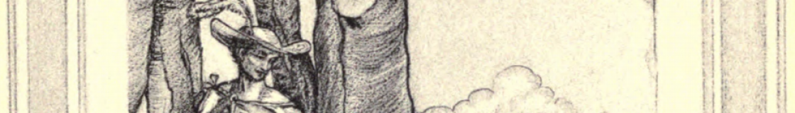
- Illustrations: the print editions of Aladore have fifteen illustrations inserted into the text on separate unnumbered pages. The draft epub had only the file name as the alt text. I decided to replace this with the image’s title as given in the print book’s list of illustrations. I also added an id so that the images could be targeted to create a list of illustrations for the ebook. I decided to enclose them in a <div class=”illustration”> to add styles since sometimes this helps with the variable devices. For example, check out what Liz Castro says about “Resizing images in EPUB.” At this point I also added a new cover image, taken from the 1915 print edition for simplicity.
- File size: one way to optimize rendering time on less powerful devices is to break up the file size. Rather than have one or two large files, I broke the XHTML into units following the semantic structure of the text. The title page, epigraph, and each chapter are separate files.
- File names: I noticed that in most of the ebooks I inspected, file names were unidentifiable. Adding meaningful names is an easy way to give future users more information about the contents. Thus, I renamed each XHTML file, for example: cover.xhtml, title_page.xhtml, epigraph.xhtml, chapter01.xhtml, etc.
- Table of Contents: After the markup and files are in place, Sigil can automatically generate a TOC for the epub. This creates a specialized file toc.ncx that older reading devices rely on to provide navigation (EPUB3 drops this feature, and replaces it with a HMTL based navigation file, nav.xhtml). However, it is best practice to add a clickable TOC to the beginning of the book for accessibility. The original print edition had a full TOC and list of illustrations, so I decided to add these features to the beginning of the ebook, after the title page.
CSS for Aladore
With the new and improved markup in place (detailed in the last post), I started prototyping CSS to style the ebook. After exploring many variations, I decided to approximate the style of the original print edition.

First page of Chapter 3.
For example, the chapter headings appear about one third down from the top of a new page. This white space reinforces the break and gives space for the large headings. I followed the same pattern, adding a margin-top to the <h2> that marks the chapter headings. Getting more detailed, you can see in the print edition that compared to the chapter titles, the chapter numbers are slightly larger, have slightly exaggerated character spacing, and have a bit of extra line space. I approximated this in the CSS with font-size: 1.35em, letter-spacing: 0.1em, and line-height: 2.5.

Chapter 3 rendered by the Readium app.
To decide on a font, I balanced what is commonly available, is considered good for reading, and resonates with the original print. I selected Georgia, because it seems very close to the print edition, is very readable, and commonly available on reading devices. The common sans-serif fonts, such as Arial, look too modern and utilitarian for Aladore.
After creating a full set of CSS for the content, I added the style sheets to the EPUB using Sigil. Since the title page and TOC use totally separate styling from the rest of the content, I gave them separate CSS. This minimizes the file size and simplifies things overall.
We tested this prototype on the three reading devices. Readium on the laptop was the only one that rendered all of the CSS styling. The Nook and Sony Reader did not support some of the details, such as letter-spacing. The testing quickly identified issues to tweak, setting off repeated rounds of prototyping.
Readium was especially helpful for this process, since it did not involve sending the file to a separate device. However, it is not much different from looking at the XHTML in a narrow browser window and it has the widest CSS support of any current reading app—so I felt like it was not a true test of the ebook. However, one issue that Readium had was splitting the illustrations in two. Both Nook and Sony automatically limit the images to the height of one screen, breaking the text before and after. Image handling is complex and frustrating, CSS styles such as page-break-inside:avoid are not well supported. One approach could be to do the equivalent of what the print edition did when inserting the plates: put each illustration in its own XHTML file, ensuring that there is a page break before and after the image. This would decrease the chance that devices will break the image in half, although it would not guarantee it! I am not satisfied with the solution in the old print edition—its kind of an ugly way to integrate the illustrations, the same for ebooks.
After some more testing, we settled on one version (for now), I will show you some details in the next post.
Typography in the News!
The current theme of ebook typography and font families at Digital Aladore happens to coincide with some digital typography current events…
Both Google Books and Amazon Kindle announced new efforts in fonts and typesetting for ereading apps this month. Oh the excitement!
Check out:
Read about Google’s new Literata font at 9to5Google or from the designers TypeTogether.
Read about Amazon’s new Kindle layout engine and Bookerly font at the eBook Reader or from the Amazon release/ad.
Of course, I am not that fond of these efforts– they are the opposite direction of the Digital Aladore project. Rather than hand crafted ebooks with love, Google and Amazon are striving for One Font To Rule Them All. Part of the charm of physical books is their distinctive character and idiosyncrasies. Why don’t ebook readers deserve that uniqueness as well?
The beauty of ereaders is that we can have it both ways: writers and publishers can encode the information about how they intend the work to be presented, but we readers can choose to view it that way OR change it to suit our particular needs. Unfortunately Google and Amazon treat books as only text, adding their own styling and layout as if these elements are completely meaningless. It is great to create better rendering engines and screen optimized fonts and layout, but these innovations should be used to enable authors’ and readers’ creativity, not lock text design into commercial ecosystems.
p.s. you might also be amused by the typographical take down of the Jeb! campaign
The Art & Practice of Typography
Its been a long and busy summer, but nothing much has happened at Digital Aladore. Far too long since the last posts! There are really only a few more to go before the project can wrap up and release the final ebook to the world. If only I can find the time…
If you need some heavy reading in traditional typography, check out Edmund G Gress, The Art & Practice of Typography, digitized by the Smithsonian:
 It is amusing to download the EPUB–why, oh why was this created? Not only is the OCR appalling on all the strange fonts and columns, but it misses the point of showing off the art of typography!
First, the OCR could be vastly improved with just a few tiny edits, for example the first paragraph of the preface reads:
IN the preface to the first edition of “The Art and Practice of Typograpliy,” the author stated that he did not “anticipate again having tlie pleasure of producing a book as elaborate as tliis one,” but the favor witli wliich tlie volume was received made anotlier edition advisable
It takes one human glance to realize that “h” is not being recognized (by ABBYY), which a computer should realize as well with a simple spelling dictionary. (Readers of Digital Aladore, of course, could fix this file up in no time!)
Meanwhile, the varied examples of type are reduced to this single CSS:
body {

font-family: "Palatino Linotype", "Book Antiqua", Palatino, Georgia, "Times New Roman", serif;

}

h1,h2,h3,h4 {

font-family: "Palatino Linotype", "Book Antiqua", Palatino, Georgia, "Times New Roman", serif;

}

p {

font-family: Georgia,  "Palatino Linotype", "Book Antiqua", Palatino, "Times New Roman", serif;

}

img {

display: block; text-align: center; margin: 1em auto;

}
Here is an amusing example: page 170,

is reduced by “ABBYY to EPUB” to this:
<div class="newpage" id="page-170"/>
<p> THE ART AND PRACTICE OF TYPOGRAPHY</p>
<p> EXAMPLE 465</p>
<p> Evolution of Roman lower-case type-faces. (A) Pen-made Roman capitals. (B) Development into Minuscules or lower-case thru rapid lettering. (C) Black Letter or German Text developed from Roman Uncials. (D) White Letter, the open, legible Caroline Minuscules, on which Jenson based his Roman type-face of 1470. (E) A recent typeface closely modeled on Jenson s Roman types. (F) Joseph Moxon's letters of 1676. (G) Caslon s type-face of 1722</p>
<p> The face first selected—and witlioiit Iicsitatioii—was foundries and tliat are available for niacliine composition.</p>
<p> Caslon Oldstyle as originally designed. Scotcli Roman was It may be well to inject liere a warning that most so-called</p>
<p> the second selection, Cheltenham Oldstyle the tliird, Clois- Caslon Oldstylcs are not as good as the one selected (Ex-</p>
<p> ter Oldstyle tlie fourth, Bodoni Book the fifth, and French amjile KiT-B) ; that Jenson Oldstyle is inferior to Clois-</p>
<p> Oldstyle the sixtli. (All shown in Example 4(57-) ter Oldstyle (Example I(i7-A) as a re])resentative of the</p>
<p> Type-faces designed and cut for j^rivate use were not original Jenson type. However, good representatives of</p>
<p> considered in making these selections, as it was believed Scotch Roman (Example 'KiT-D) are obtainable under the</p>
<p> best to adhere to type-faces that are procurable from most name of Wayside, of National Roman, etc.</p>
<p> ABCDEFGH IJ K L M N O P O R S T U V WX YZ</p>
<p> a h c cl e f g h i j k I m n o ]:> q r s t u v w x y z How it appears assembieel</p>
<p> (A) Modernized Oldstyle, the Miller & Richard type-face of about 1852</p>
<p> ABCDEFGHIJKLMNOPQRSTUVWXYZ abcdef ghi jklmnopqrstuvwxyz How it appears assembled</p>
<p> (B) Century Expanded, the Benton "modern" type-face of 1901</p>
<p> EXAMPLE 466</p>
<p> Two standard type-faces that rate high in legibility, but that are colorless in the mass and lacking in the pleasing irregularities of form that characterized Roman type-faces before the nineteenth century. The various qualities of legibility found in Modernized Oldstyle have been converted to narrower letter shapes and more "modern " form in Century Expanded</p>
Which means it looks something like this on your ereader:
 Hard on the eyes and meaningless!
The example illustrates the issues we have been dealing with at Digital Aladore– ebooks are awesome, but how can be bring the craft back into publishing?
Take a Peek at the Markup!
A few posts ago I outlined the improvements to the underlying markup of the text, moving us beyond the draft ebook. Lets take a concrete look at what this means.
Here is what Chapter 3 of the draft Aladore EPUB looked like:
<h2 id="sigil_toc_id_3" style="text-align: center;">CHAPTER III.<br />

HOW IT FORTUNED TO YWAIN TO FIND A STAFF IN THE PLACE OF HIS SWORD.</h2>
<p>THEN Ywain turned his face towards the village, and went down the hill: and he went with a good heart, for though the boy had left him, yet he hoped not to be long without him, and even now when he looked straight forward it seemed that he had the joy of his company and his laughter. But when he turned and looked beside him, there was but his own shadow; black it lay and long, and about the edges of it a brightness was shining. Then he remembered that the sun was low and night rising among the hollows, and he bethought him of his supper and sleep.</p>
<p>So he went quickly to the village, and passed through it and came to the farmer's house that lay beside the great wood: and the farmwife gave him welcome, as one that knew not who he was, but could well pitch her guess within a mile or so. And she whispered to her husband, but he was hard of hearing and full of slumber from the fields. So when Ywain had supped, they showed him where he should lie. And when he was come there he laid him down, and the day went from him in a moment and he knew no more whether he were alive or dead.</p>
The new version of the markup looks like this:
<div class="chapter">
<h2 class="chapterHeading"><span class="chapterNumber">CHAPTER III.</span><br />HOW IT FORTUNED TO YWAIN TO FIND A STAFF IN THE PLACE OF HIS SWORD.</h2>
<p class="firstParagraph">THEN Ywain turned his face towards the village, and went down the hill: and he went with a good heart, for though the boy had left him, yet he hoped not to be long without him, and even now when he looked straight forward it seemed that he had the joy of his company and his laughter. But when he turned and looked beside him, there was but his own shadow; black it lay and long, and about the edges of it a brightness was shining. Then he remembered that the sun was low and night rising among the hollows, and he bethought him of his supper and sleep.</p>
<p>So he went quickly to the village, and passed through it and came to the farmer's house that lay beside the great wood: and the farmwife gave him welcome, as one that knew not who he was, but could well pitch her guess within a mile or so. And she whispered to her husband, but he was hard of hearing and full of slumber from the fields. So when Ywain had supped, they showed him where he should lie. And when he was come there he laid him down, and the day went from him in a moment and he knew no more whether he were alive or dead.</p>
Note the div class chapter, chapter heading class, chapter number span, and first paragraph class. Here is the new CSS relevant to this selection:
body {

font-family: Georgia, serif;

margin-left: 1.1em;

margin-right: 1.1em;

}
h2.chapterHeading {

font-family: Georgia, serif;

font-size: 1.15em;

line-height: 1.6;

text-align: center;

margin-top: 5em;

margin-left: 3em;

margin-right: 3em;

}
span.chapterNumber {

font-size: 1.35em;

letter-spacing: 0.1em;

line-height: 2.5;

}
p {

text-indent: 1.2em;

line-height: 1.5;

margin-top: 0em;

margin-bottom: 0em;

}
p.firstParagraph {

text-indent: 0;

margin-top: 0.5em;

}
Which should get us to something that looks like this:
Chapter 3 rendered by the Readium app.
